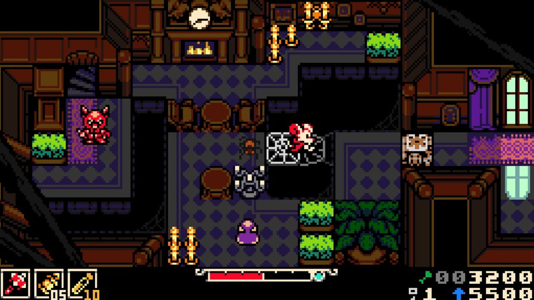


A graveyard at night, rendered on a screen that in 1998 would have measured a little over two inches across. Mina stands among the headstones in the pale wash of a moon that is, on inspection, a flat disc of the lightest colour the scene contains. Something is coming toward her over the grass: a shape of perhaps forty pixels, dark against a dark ground, legible as a threat several seconds before it is legible as a creature. She swings. The protagonist of Mina the Hollower fights with a whip and a stake, and the animation of the swing is fast and fluid and modern, even though the resolution it plays out across is neither. The shape comes apart. The encounter has been conducted in a palette of maybe eight colours, on a field a hundred and forty-four pixels tall, and the notable thing about it, the thing worth an essay, is how much of what just happened was never on the screen at all.
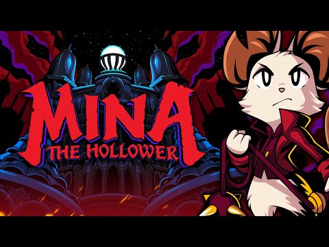
Mina the Hollower, the action-adventure game Yacht Club Games releases on 29 May 2026, renders itself in the visual register of the Game Boy Color, the handheld console Nintendo shipped in 1998. This is an Image and Sound essay, and its argument is that the register is not nostalgia, and that treating it as nostalgia mistakes the most interesting thing the game is doing. The low-resolution, high-contrast, palette-starved image is not a worse picture that a generation happens to remember fondly. It is a different kind of picture. It asks the viewer's visual system to perform work that the high-fidelity image has quietly relieved it of, and that work, not the pixels themselves, is the aesthetic experience the game has been built to deliver.
It helps to be precise about what the Game Boy Color was, because the precision is where the argument starts. The console was, in 1998, a compromise. Its screen held 160 by 144 pixels and could show as many as fifty-six colours at once, drawn from a possible palette of around thirty-two thousand. Those numbers were not chosen by an artist. They were the resolved equation of battery life, manufacturing cost, and the liquid-crystal display technology that the price point could bear. The constraint was economic, and it was experienced by the developers of the era as a constraint, a set of walls inside which the work had to fit. What happened over the platform's commercial life, though, is that a generation of designers learned the inside of those walls so thoroughly that the walls began to produce things. The specific palette logic of Link's Awakening DX in 1998, the animal animations of Pokemon Crystal in 2000, the heavy ink-dark silhouettes of the Game Boy Castlevania titles, were not merely the best those designers could manage against the limit. They were discoveries the limit made available, and some of those discoveries do not survive being ported to a screen that has no limit at all.
The reason a constrained image can do more rather than less begins with a fact about vision that the ordinary experience of seeing conceals: the visual system is not one system. Margaret Livingstone, a neurobiologist whose book Vision and Art set out the relevant findings for a general readership, describes a visual apparatus split, very early in its processing, into pathways that handle different aspects of the image and barely speak to each other. One of these pathways is fast, sensitive to contrast and luminance, attuned to edges and motion and the coarse structure of a scene, and essentially colourblind. It is the part of vision that works out where things are and how they are moving. The other is slower, attends to fine detail and to colour, and handles the question of what a thing precisely is. Form, depth, and motion are carried mostly by luminance. Colour, on its own, is a poor guide to structure.
A Game Boy Color image is, by the accident of its constraint, an image addressed almost entirely to the first pathway. It is built from sharp luminance steps and high contrast, because a palette of a few colours cannot do subtle gradient work and so does its work in hard edges instead. It is coarse, because it has to be. Livingstone's account does not say anything directly about pixel art, and it would be an overreach to claim that it does. But it explains, cleanly, why a low-resolution high-contrast image can register as forceful and immediate rather than as impoverished: it is an image that hands the structural, form-building part of vision exactly the kind of information that part of vision is fastest at using, and very little else to slow it down. The picture looks decisive because it is speaking directly to the part of the eye that decides.
The second half of the explanation is about what the eye does with the gaps. Gaetano Kanizsa, a Gestalt psychologist, spent a career on the visual system's habit of completion, and the figure that carries his name is the cleanest demonstration of it: arrange three dark shapes with wedges bitten out of them, and the visual system will see a solid white triangle lying on top, with crisp edges, slightly brighter than the page. The triangle is not drawn. No edge of it exists in the image. The brain has supplied it, because supplying it is what the brain does with an arrangement that implies more than it states. The completion is not an error and it is not optional. It is the ordinary operation of sight.
The forty-pixel creature crossing the graveyard in Mina the Hollower is, in this light, not a depiction of a creature. It is a prompt. The cartridge stores a small, blunt arrangement of dark pixels, and the player's visual system, presented with that arrangement in motion, builds the creature - assigns it mass, intention, a front and a back, a way of moving that reads as predatory. The image that the player experiences as frightening is assembled behind the eyes, out of materials the screen only gestured at. The pixel artist's real medium is not the pixel. It is the player's completion reflex. A good low-resolution image is a good set of instructions for a process the artist cannot see and does not control, and the artistry lies in knowing exactly how little has to be specified for the process to run.
This is the point at which the high-fidelity image can be brought in for contrast, and it has to be brought in carefully, because the argument is not that photorealism is a failure. The high-fidelity image is an extraordinary technical achievement and it does real things well. But it does them by handing the eye a finished surface. When a contemporary rendering pipeline resolves a monster down to the individual damp hair and the correct subsurface scattering of lamplight through its skin, it has answered, in advance, every question the visual system might have asked. There is nothing left to complete. The perceptual apparatus, presented with a fully specified image, can essentially coast: receive it, verify it, move on. The engagement is lower not because the image is worse but because the image has done the viewer's share of the work. The constrained image cannot afford to do that. It is too poor to finish itself, and so it conscripts the person looking at it. Looking becomes participation rather than reception, and participation is felt.
Yacht Club Games has built its existence on this proposition, and it is worth saying that the studio arrived at it deliberately rather than sentimentally. Shovel Knight, the game that founded the studio in 2014, rendered itself in the register of the eight-bit Nintendo Entertainment System, and it did so with a precision that made the choice legible as a choice: it used the old palette while quietly spending modern computation on animation counts and screen logic that the original hardware could never have run. The studio's designers, Sean Velasco among them, have been consistent in interviews that the limit is not a costume. It is a working method. The constraint removes a vast space of options that would otherwise have to be evaluated, and what remains, having been forced through the narrow channel, tends to be stronger for the compression. This is the sense in which the lo-fi register is an aesthetic position and not a reproduction. The designers are not rebuilding their childhoods. They have found that the wall is generative, and they have walked back toward it on purpose.
Mina the Hollower makes a specific choice within that position, and the choice is the part of the game worth the closest attention. The studio did not return to the eight-bit register of Shovel Knight. It went forward one hardware generation, to the Game Boy Color, and it paired that register with a Victorian Gothic setting of graveyards, monsters, whips, and lamplight. The pairing is not arbitrary. It is the essay's central claim that the constrained image and the Gothic mode are, at the level of how they operate on a viewer, the same instrument used in two different centuries.
The Gothic has always been a mode of partial sight. Bram Stoker's Dracula, in 1897, is built almost entirely from fragments and withheld views: journal entries, letters, a ship's log, the recollections of frightened people, each account seeing a part of the thing and none of them seeing all of it. The horror of the novel is not in what is described. It is in what the arrangement of partial descriptions forces the reader to assemble in the dark between them. The gas-lit nineteenth century was, as a simple physical fact, a century of poor light: a world in which most interiors after sunset were a small pool of lamplight surrounded by a great deal of unresolved shadow, and in which the eye spent every evening doing completion work on rooms it could only partly see. Gothic fiction is the literature that the gas lamp made, a literature precisely tuned to the perceptual condition of not being able to see the whole of the room.
The Game Boy Color image is the gas lamp translated into pixels. It is, by its constraint, an image of small resolved areas surrounded by darkness the viewer must finish. A graveyard rendered in fifty-six colours and a hundred and forty-four lines is not a deficient graveyard. It is a graveyard delivered in exactly the perceptual condition the Gothic was invented to exploit: most of it withheld, the threat implied rather than shown, the player's own completion reflex doing the frightening. A high-fidelity horror game has to work against the grain of its own technology, spending enormous effort to hide and obscure and under-light an image its pipeline is straining to render in full. A Game Boy horror game has the withholding built into the hardware. The limit and the genre want the same thing.
It is worth being honest about the obvious objection, which is that this is all a flattering story told after the fact, and that the real engine of the lo-fi register is simply that the audience is in its thirties and forties now and is buying the textures of its own childhood. The generational economics are real, and no argument should pretend otherwise. But the objection does not survive contact with the work, because nostalgia and the perceptual account predict different games. A game running purely on nostalgia would reproduce the limit's surface and quietly discard its discipline: it would keep the chunky pixels and the small palette as a skin, while spending modern resources on conveniences the old hardware could not afford, until the constraint was decorative and the image no longer asked the eye for anything. Some retro-styled games do exactly this, and they read, correctly, as costume. The studios that treat the constraint as a working method do the opposite. They hold themselves to the limit even where breaking it would be invisible to a nostalgic eye, because the limit is not the point of sale. The completion reflex is. Mina the Hollower, on everything its studio has shown and said, belongs to the second kind, and the difference between the two kinds is not visible in a screenshot. It is visible in whether the eye, once inside the game, is given work to do.
There is a larger frame here, and it extends well past one game and past the lo-fi movement that produced it. The contemporary image economy, across screens of every size, has been moving in one direction for forty years, toward more resolution, more colour, more fidelity, more of the image specified in advance. Each step has been a genuine improvement by the metric the industry uses to measure improvement. But the metric only counts what is added to the screen, and it has no entry for what is subtracted from the viewer. What the high-fidelity image subtracts, slowly and without anyone choosing it, is the eye's job. A perceptual system that is handed finished images for most of its waking hours is a perceptual system being asked to do less and less of what it evolved to do, which is to build a stable, navigable world out of fragmentary and ambiguous information. The constrained image is not a rebuke to that economy and it is not going to reverse it. But it is a small, deliberate, commercially viable place where the older arrangement still holds, where the picture is incomplete on purpose and the person looking is restored to the status of a participant in their own seeing.
That is the quiet thing Mina the Hollower is offering, underneath the whip and the headstones and the very good moon. It is offering an image that is not finished, and the unfinished image returns something the finished one cannot. The creature on the dark grass is forty pixels on a cartridge and a whole animal in the mind, and the distance between those two facts is the distance the player's own vision travels every second the game is running. The screen has handed the eye less than a screen usually hands it. In exchange, the seeing is the player's again, the way it was always supposed to be, the way it is on every dark path and in every half-lit room where the picture has never once arrived complete.